Lesson Transcript
Hi, this is Adam Paol Seagram and in this video we’ll be talking about the use of different color schemes in your painting.
Even though we will be using acrylic paintings as examples in this lesson, the concept can apply to oil and watercolor painting as well.
So why is this important? Well, as you are painting, it can be difficult to know which colors to use in your paintings.
“Does this red go with this orange?”
“If I add more blue to the painting, will that throw off the color balance?”
By knowing about the different color scheme that are used in painting, it will give you a framework to think about these question and help you make an educated decision.
Ok, so let’s get started!
3 Types of Color Schemes
So when it comes to painting, there are 3 types of color schemes: monochromatic, complementary, and multi-chromatic.
Let’s go over each one.
Monochromatic Color Scheme
This first color scheme is monochromatic. This is where the painter only uses one color in the painting. He can use different value of that color (darker or lighter) but he will introduce any other color (or at least not in any significant way).
For example, in this painting, I only used a deep blue color (and it’s various different values) and white.

Using a monochromatic color scheme tends to create a very interesting atmosphere in your painting. For example, by using a very cool color (blue), this painting has a very relaxing, laid back feel to it.
If I were to use a very hot color (red), it would create a very intense and vibrant feeling.
The fact that we are only using one color makes this effect very prominent, as the cooling effect of the blue becomes unmistakable.
Complementary Color Scheme
Our second color scheme is complementary. This is where the artist uses two colors that are “complementary” to one another.
Complementary colors are those that are directly across from each other on the color wheel.
In this example, we have red and green, which are opposite each other on the color wheel.
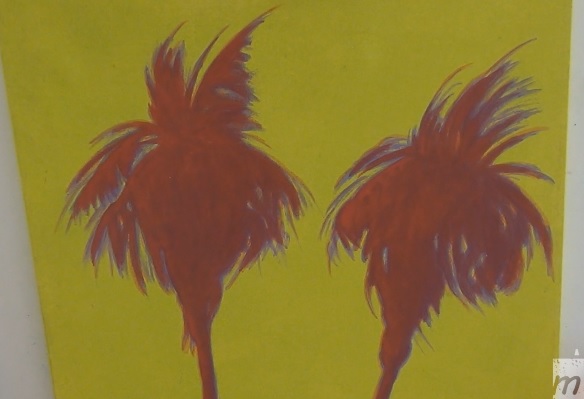
In the painting, the background is a yellowish-green and the trees are red and orange. So even though the colors are not strictly across form each other, they are very close and the principle still applies.
So what is so special about using complementary colors?
Complementary colors have a special property in that they contrast each other and make each other stands out much more.
It’s sort of like when you put a black next to white, the black will appear much darker and the white will appear brighter. Complementary colors are the opposite of each others and so they make each others look much more vivid when placed side-by-side.
Here’s another example of a complementary color painting:
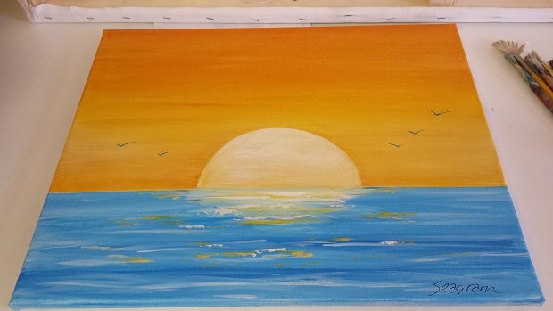
Here the complementary colors are blue and orange. Notice the beautiful contrast that this creates.
Multi-Chromatic Color Scheme
The last color scheme is multi-chromatic. As the name suggests, this is the use of many colors. You can use as many colors as you like to create your painting.
Now, even though you can use as many colors as you like, you should still exercise some restraint to keep your painting from looking to chaotic.
This is example, even though you can find all the colors of the palette in this painting, there are definitely certain colors that are more dominant than others.
Again you still want to have a theme to your painting: have some main colors and supporting colors.
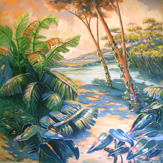
Here’s another example of a multi-chromatic color scheme:

Again, even though all the colors are used, the dominant color in this case is green.


I’m looking and trying for someone to have imaginative and architecture on some project of real estate development on seaside(Thai Gulf) and hill.